How to Get the Best Print Color? RGB vs CMYK

As an online store owner, you surely at some point have experienced the difference between your design and the final product print colors. For customers, the end product they receive must meet or exceed their expectations, and sometimes, the color difference can be frustrating. Whose fault is it? The truth is, it’s nobody’s fault. The fact of the matter is, there are two color modes: RGB and CMYK.
RGB vs. CMYK: What Is the Difference?
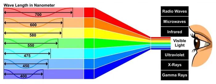
Both CMYK and RGB are color mixing modes in graphic design. In short, RGB is best for digital work – the ones you see on your screen and CMYK for print products. However, it’s essential to fully understand the mechanics behind each to optimize your designs and understand why the colors you see on your screen and the print colors on the product don’t always match.
What Is RGB
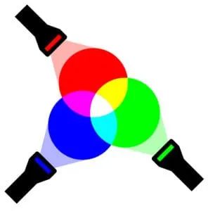
RGB, which stands for Red, Green, and Blue, is the color space for digital imagery. RGB color model is used for displaying digital work on any screen.
As you might know, a light source within a device creates any color you need by mixing the colors red, green, and blue in various proportions, and this process is known as an additive color model, where all colors start as a blackness, and then RGB lights are added on top of each other to make it brighter and create the desired pigment. Pure white is created by mixing red, green, and blue light at equal intensity. Colors perceived in additive models are the result of transmitted light.
Aspects like vibrancy, saturation, and shading can be controlled by adjusting any of the RGB colors. Because this process is all digital, you can manipulate how the light on the screen reveals to create the desired color.
When Is RGB Used?
In short: all things digital: any visual content that includes videos and photos; web and app design, icons, graphics, buttons; branding – designing logos, ads, banners, etc., as well as social media-related products like profile pictures, cover photos, images for posts and others.
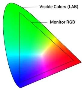
To effectively and efficiently represent colors on your screen, practically every computer and mobile device on the planet uses the RGB color system. Red, Green, Blue are coded in computer-understandable language – using bits. Due to technical limitations, the RGB color gamut (the maximum range of colors for color space) is smaller than what your eye can see.
What Is CMYK
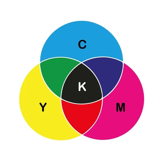
CMYK, which stands for Cyan, Magenta, Yellow, Key (Black), is the color model for tangible, printed materials, or shortly – CMYK is print colors. In this case, the printer creates images by mixing CMYK colors to varying degrees with ink instead of digitally as it is with RGB. This is called subtractive mixing. If with RGB, all colors started as black, with CMYK, they begin as white, and each layer of ink decreases the brightness to create the desired color. When all the colors are mixed together, they produce black darkness. Colors perceived in subtractive models are the result of reflected light.
When Is CMYK Used?
CMYK is used for any design project that gets physically printed instead of viewed on a screen. So, if you need to recreate the design you see on screen with ink, the CMYK color model will provide you with more accurate results. This includes all things branding: business cards, custom stickers, custom stationery, store signs, etc. Also, everything you can imagine related to advertising: custom posters, flyers, billboards, booklets, and then something close to our home: merchandise. Custom t-shirts, custom totes, hats, and other apparel and accessories are created using the CMYK color mode.
Which One Should You Use?
First of all, CMYK guarantees a more reliable reproduction from what you see on screen versus the final print. When you convert RGB files to CMYK to print on a four-color printer (which is the absolute majority of printers), there generally are shifts in color. These shifts usually are minor, but they can still be an issue, especially if your design project is color-sensitive. Similarly, if you were to upload a CMYK image to the internet, you may also see color shifts.
File Types and Specs
PNG file type:
- Supports RGB and sRGB Color Modes
- Supports transparent background
- Works for apparel, all other products
JPEG file type:
- Supports RGB, sRGB, and CMYK Color Modes
- Doesn’t support transparent background
- Works for everything is transparent background is not necessary
For all products for which you want to have a transparent background, such as apparel, you will have to use a PNG file. Unfortunately, PNG does not support the CMYK color profile. However, that’s not a big problem because you can design the CMYK color mode’s image to reflect the CMYK color gamut. This way, you will have a little discrepancy between what you see on screen and on the actual print.
When a printing company says that they print using RGB, what they mean is that they accept RGB format files. Before printing, every image goes through the printing device’s native raster image process (RIP), which converts the PNG file with an RGB color profile to a CMYK color profile.
Start Printing for Free!
How to Convert RGB Design to CMYK?
If you have created your design in RGB, you can preview how your design might look printed if you convert it to CMYK, which will give you an approximate idea of the color shift. But first, let’s look at some problems that may arise.
Print Colors and Limitations
Printed products like t-shirts, custom mugs, and canvas prints don’t emit but only reflect light. Therefore it is not possible to use the same additive RGB color system for printing. As a result, CMYK has a smaller color gamut than RGB. It would help if you remembered that it is impossible to print bright red, bright green, or bright blue colors (and neons, too) with the CMYK color model.
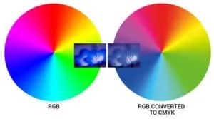
If you use the RGB color system to create your designs, here is an example of a common issue in how a computer will display your design and how the garment will look once printed.
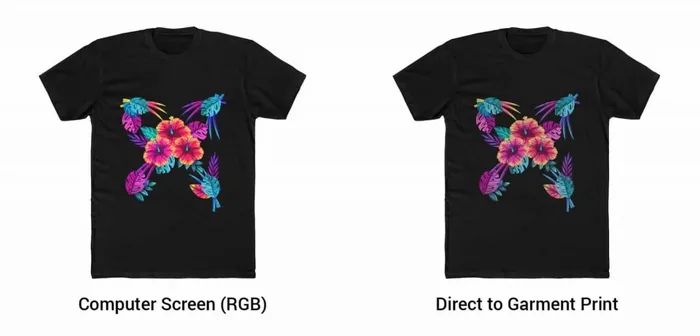
On the left, there is an uploaded RGB file with a bright red print. On the right, you can see how it would look when printed using CMYK colors. Bright colors lose their intensity and look duller.
There is a simple solution to avoid such unpleasant surprises with your beautiful designs. By setting your Photoshop or Adobe Illustrator image settings to CMYK, you will see on-screen colors close to the actual print.
Photoshop
Before creating the art file click: Image-> Mode -> CMYK Color
Illustrator
Before creating the art file, click File->Document Color Mode -> CMYK Color
Tip: If you don’t have access to any design software, you can also use the CMYK preview feature in our Product Creator for more realistic previews.
If you’re downloading images and graphics from an online resource (make sure they’re royalty-free!), don’t forget to convert that image to CMYK (and make sure it’s hi-res to ensure high-quality print). However, all this doesn’t mean that all your designs must be converted to CMYK; If your customers want to see the actual representation of the colors, then the CMYK color palette is the closest to reality.
How to Make Sure Your Print Colors Are What You Want Them to Be
First and foremost: get samples. We recommend opening an online store only after sampling the goods you’re going to offer to your clients. Why? What if the colors you’ve chosen for your custom hoodie line fail to shine as bright in real life, thus causing dissatisfaction in your customers and yourself? Nobody needs that kind of negativity in their life. The difference in print color vibrancy is a real issue. What might look crazy vibrant on nylon or PU leather could look dull on cotton. So – sampling is everything. By sampling, you can also feed two birds with one scone: see the quality of your product and become a walking billboard for it.
How to Get Bright Print Colors With CMYK?
Unfortunately, it’s not always possible to reproduce the bright and saturated colors you see on your retina screen to tangible products. For example, if you’ve designed a bright, colorful floral pattern in RGB and want to convert the same colors to CMYK, they won’t look as bright in print. The most brilliant colors achievable using CMYK are solids. First, 100% of cyan, magenta, and yellow will appear as the most colorful colors available in print.
Again, these colors will not come out as bright as they appear onscreen. RGB color model has many more shades available than CMYK. Also, a backlit screen will create a more brilliant color than any pigment on canvas or any other material can match. However, some materials are superior to others when it comes to color brightness: PU leather, for instance, will give significantly more vivid outcome than a cotton hoodie, but that’s physics, man. Can’t to anything about it, just enjoy the comfy sweater, even if it’s a teensy bit more dull than it looked onscreen.
So, if you want bright, solid colors is your guy. For example, 100% cyan +100% yellow creates a bright green. If your interpretation of “bright” does not necessarily mean “saturated,” you will have to tint those colors. Note that this is one thing at which process colors (CMYK) are the least effective. These are the limitations of process colors.
Printify Is Awesome for Your Print-On-Demand Needs!

If you’re new here, Printify is a superb way to get started. First of all, Printify is free for everyone, no matter how big or small your online business is. Signing up, designing merch from our vast catalog (it contains more than 800 different customizable products), and integrations with the most popular online marketplaces in the world, all of it is free.
By the way, we can’t talk about designing products without mentioning the Product Creator (formerly known as Mockup Generator), with which you can put to use your newly acquired knowledge about print colors. It’s oh-so-easy to use and generates stunning product mockups for you to add to your online storefront.
And for those who plan to sell a bit more, check out Printify Premium. By subscribing, you get 10 stores per account, unlimited product designs, and up to 20% discount on all products.
How to Achieve the Best Possible Results
Upon selling merch online, the most important thing is to find a niche you’re passionate about and then market these products to your customers. People tend to care more about what the product represents and not what exact tone the printed color is. However, let’s not forget about our nitpicky brothers and sisters, so it’s always better to sample first, then sell.
However, unless you are a corporation with a strict brand book, there really is no point in spending excessive amounts of time in color calibration or management. All you need is to make sure that what your customers see on their mobile or computer screens is as close as possible to the actual print colors that they will receive. Purple instead of blue? No bueno. Dark blue instead of a different shade of dark blue? It’s okay.
Print Color Combos and Most Frequent Errors
- Different print providers have different workflows for creating their products.
- White designs can not be printed on Natural/Vintage Tote Bags, the process won’t allow this.
- You can’t achieve neon or glow-in-the-dark colors.
Conclusion
Now that you know that you should use RGB for online graphics and CMYK – print colors – for tangible goodies, you’re ready to tackle the next step: designing your own line of clothing, accessories, home decor, and other lucrative merch to add to your eCommerce store. Designing, selling, and earning a nice steady stream of side income (or main income, for that matter!) with Printify is so very easy. There are more than 300 blank products on which you can express your creativity. We’ve got 90+ printing partners worldwide that you can try out and decide which one is the best for your business needs. So, go ahead, get your creative juices flowing and design the CMYK out of it.
Start Your Business Today!
Keep Exploring Our Blog
Written by

Baiba Blain
Share the article
Topics

17 comments
pls I don’t understand converting RGB to CMYK?
please how will I know that the picture I downloaded for my design has RGB or CMYK color?
Hi Salifu,
When designing items, the file should be saved in an RGB color profile. In fact, jpg, png, and svg files will always be saved in an RGB color space, as they do not support a CMYK profile. File formats that support CMYK color profiles are different and not part of the file formats that we accept. In other words, exporting a jpg, png, or svg file in a CMYK color profile isn’t exactly possible, as the print provider will still have to convert the design file for printing. Simply, the design file should be in an RGB color profile, and that will be perfectly sufficient.
Now, the part where CMYK comes into play is the fact that RGB and CMYK profiles have different colors. RGB has a wider scope of colors that it can produce, while CMYK has less. This is where color shifting can come into play. To explain, before printing, the design file is converted from an RGB color profile to a CMYK color profile by the print provider, as we discussed. This conversion can result in some color shifting, as the CMYK color profile cannot replicate the full spectrum of colors the RGB color profile has. In most cases, the shift is minimal to none, however, for certain tones, bright and/or neon-esq colors, a noticeable shift may occur. More about this is explained in our design guide here.
This potential color shifting is the reason why we advise previewing the design file in a CMYK color profile to see if there are any significant changes in the coloring. For previewing the potential color shifting that converting from RGB to CMYK may cause, I would suggest using a tool like Photopea. The option to preview in CMYK will be under the ‘image’ tab and the ‘mode’ option.
Why not just use PANTONE (r) color codes to describe the colors you want. That’s what they are created for. Get a Pantone wand to help you pick colors in case your computer or their printer is not calibrated correctly. That helps the printer calibrate your image.
Hi there!
Pantone color codes work best for screen printing. Digital printing uses CMYK only and even if we convert Pantones to CMYK it will still not give out the exact color tones on actual print. Just in case, here is a bit more information.
I would like to find a card, about business card size and made ideally of plastic (similar to a loyalty card / gift card) that has printed on it 4? sets of ‘calibration’ markers.
1) a true black and white ‘ruler’ scale in X and Y direction, or full ‘frame’ – to use for ‘full scale’ adjustment of colour palette as well as size scaling.
2) a set of greyscale swatches (0, 25%, 50%, 75%, 100%) for lighting calibration and midtone adjustments etc.
3) a set of CMYK swatches (4 (or more?)) for colour adjustment / calibration.
4) a set of RGB swatches for colour adjustment / calibration.
The card should be of a known (non-white) colour (10% grey?) so as to be distinguishable from the white swatches.
These cards could then be placed next to a sample to be captured (photographed) and brought to a colour matching service where the card in the photo could be used as a calibration reference to allow adjustment of the photographed sample for a more accurate match that takes into account the lighting / ambient colour distortion of the surrounds.
I have not seen anything like this available but think this is something that should be available at every DIY and paint store.
Hi there,
I am a little unsure after reading this article and the comments above, but based on the above would this be the correct way to do it to ensure the t-shirt I want printed has the colors I used to design it:
-When designing in Adobe Illustrator, do the design in CMKY
-When exporting, export in RGB with PNG file type (so background will be transparent)
Is this the best way of doing it?
Hi Darcy,
Yes, that would be the best way of doing it, however we still would recomment ordering a sample to see how the colours come out in real life. Generally, they will appear less bright and vibrant than the image on the screen.
I don’t get it, particularly this sentence: “However, that’s not a big problem because you can design the CMYK color mode’s image to reflect the CMYK color gamut.”
Do you mean ‘you can design the RGB color mode’s image to reflect the CMYK color gamut’? That would make sense.
So, do we want to design in the CMYK color mode and then switch it to the RGB mode when outputting the file? (I’m using Illustrator).
Hi David,
Yes, for the best color accuracy, we would recommend creating the design in CMYK and switching to an RGB color mode when exporting the design.
Do you have a formula of how to represent correct CYMK mixing as RGB?
I am a software developer for imaging online program.
Thanks a lot
Hi Gao,
Unfortunately, we don’t have a specific formula, since each of our providers might convert the colors slightly differently based on the system and equipment they’re using. However, you can use the formula present in your image editing program or a general color conversion formula.
Please Suggest Me, For Fashion Image, Which One Should i Use RGB or CMYK Colors..?
Hi there,
We accept files with various color spaces, but our system does all operations in red, green, and blue (RGB). If you upload a cyan, magenta, yellow, and black (CMYK) file, be aware that our system will convert it to RGB and the colors might shift significantly. You can find out more about this here.
Do you have colour swatch samples like Printful? I would like to purchase a tshirt with every cmyk colour on for reference when making designs.
What is the best color palette to use on a home printer for paper, as in printing a photo. I’m so confused as to whether to use RGB or CMYK. I read conflicting information.
CMYK has the smallest color gamut. If you want vivid colors, especially red, good luck. Check the gamut warning in PS. Go to View > Proof Setup > CMYK > then Gamut Warning. Adjust the colors until the warning color wash is gone and see what you’re left with.
Hi , thanks for your detail explanation.
Can we use adobe CS6 colour profiles to print good CMYK print?
Please advise Can colour profile helps to print bright colours ?
Thanks